The Essential Guide to Understanding Contrast in Graphic Design
Contrast plays a pivotal role in the realm of graphic design, acting as one of the most powerful tools at a designer’s disposal. It’s not just about making elements stand out; it’s about creating visual interest, guiding the audience’s attention, and conveying messages more effectively. From color and size to typography and texture, understanding the nuances of contrast can elevate your design work from good to great.
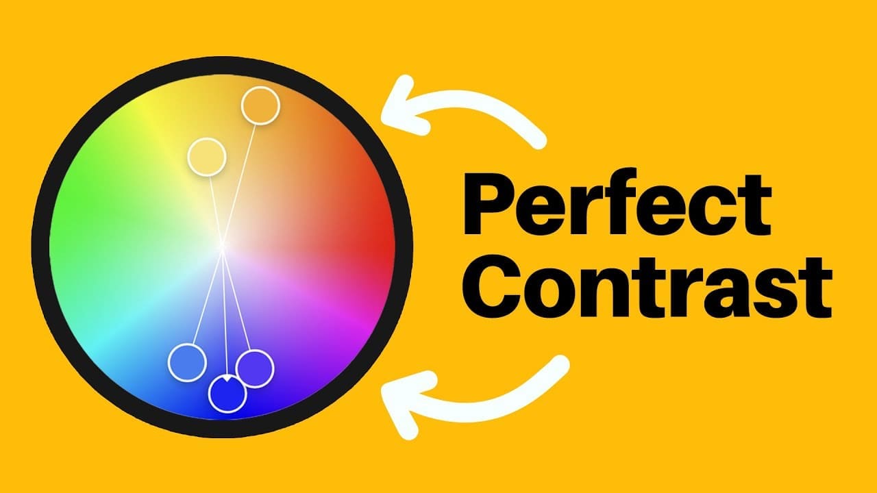
Contrast of Color: A Vibrant Start
One of the most recognized forms of contrast is that of color. Utilizing colors that are opposite each other on the color wheel creates a dynamic visual impact. This is because these combinations offer the highest degree of contrast, drawing the viewer’s eye with ease. Tools like Envato Elements and Luminar Neo can provide inspiration and resources for experimenting with color contrasts in your designs.
Additionally, mixing low-saturated colors with bold, saturated ones or combining grayscale elements with splashes of color can evoke specific atmospheres or emotions, such as a sense of melancholy or excitement. This technique is particularly effective in call-to-action buttons or social media UIs, where contrast is used to create an addictive response or highlight premium options.
Contrast of Size: Hierarchy and Importance
Contrast in size, essentially a form of visual hierarchy, dictates that larger elements are perceived as more important. This principle is evident in designs where the focal point is the largest object among others, immediately capturing the viewer’s attention. Websites often employ size contrast in their sign-up pages, where the most desirable option is highlighted through scale. For a surreal effect, designers can play with contrast of size to captivate and intrigue their audience.
Typography and Contrast: More Than Just Size
When it comes to typography, contrast extends beyond size. It encompasses color, weight, and typeface styles. A combination of large and small type, bold and light fonts, or contrasting colors can make certain information stand out. Tools like Placeit and graphicriver offer a myriad of typography options that can help designers implement contrast effectively in their projects.
Advanced Contrast Techniques: Beyond the Basics
Delving deeper into contrast, we find its application in texture, style, and even psychology. A Nike poster, for example, demonstrates contrast through color, shape, and texture, emphasizing the product in a subtle yet effective manner. Contrast of style, as seen in designs combining minimalistic elements with photographic details, creates visual intrigue and highlights key elements.
Contrast in UI/UX Design: Guiding User Interaction
In UI/UX design, contrast is crucial for guiding user interaction and drawing attention to important elements. The use of contrasting font choices, weights, and colors can highlight essential information or actions. Applications like Dealjumbo provide resources that can be used to implement contrast effectively in app designs, ensuring a user-friendly experience.
Contrast of Concepts: Reinventing Design
Finally, contrast of concepts involves taking a fresh approach to traditional designs. By contrasting a 2D, flat concept with a more 3D, modern approach, designers can create more engaging and impactful work. This technique challenges the norm and encourages designers to think outside the box, resulting in innovative and memorable designs.
In conclusion, mastering contrast in graphic design opens up a world of possibilities for creating visually compelling and effective designs. Whether through color, size, typography, or concept, contrast can significantly enhance the overall impact of your work. By exploring and experimenting with different forms of contrast, designers can continue to push the boundaries of creativity and innovation.
Timestamps
0:00 Most Important Contrast Video
0:10 First Basic Version Of Contrast
0:55 Size Contrast Is Hugely Useful
2:00 Third Basic Version Of Contrast
2:42 More Advanced Contrast
4:52 Style Contrast
5:54 Textured Contrast
6:39 Psychological Contrast?
8:01 Emotional Contrast?
8:47 Ui/UX Contrast
10:45 Contrast Of Concepts?
12:07 Satori Life Issues/Update
@SatoriGraphics
Have a great weekend! I did mention in the video why I haven't uploaded much recently, and why this video is a remastered compilation of a design topic. Peace 🧡
@AhmedRaouf185
Oh Man, i presse Like before i watch or even read the Title 😂
@user-lc1gy3ug4h
Please more videos on ChatGpt brief
@ankeneharigreen8539
Thanks Satori for the Contrast Course.
@dougveganparadisebuilder5808
Excellent video as always! You should do a YouTube video course. The smooth mix of visuals shows your professionalism.
And I found the typo again!
@user-kf1fq1ly8s
Thank you for this in-depth walkthrough. Nobody explains it like you do. ✨
Wish you good health
@user-bq9kz6ez6g
Can I start graphic designing as hobby
@Jattforce24X
One of many The ONLY videos from Satori 😂
@CAT-2323
I’m taking Graphic Design in school right now and I love these videos they make me excited about design.
@budhrajkumar2587
Very helpful ❤
@joshuacrosthwaite
thank you for the tips, making my designs better and better every video- much appreciated ❤ 🙂
@rogerio8710
Que aula! Muito obrigado por esse curso premium gratuito que é o seu canal. Nunca aprendi tanto a fazer design elegante e de bom gosto como agora. Muito obrigado novamente, está me ajudando muito nesse meu começo como designer.
@drawwithaxel168
I have trouble understanding when I should add more contrast to a design or add more similarity to a design. If anyone has any tips let me know.
@jhasani79
Amazing content as always! So many points highlighted and to apply. Glad to hear you are doing well.
@prajnyabaliga
❤
@kkrsnn5632
Great stuff. Graphics 101😎
@thewebstylist
Holy smokes man, every level of design elements is so spot on in this video and its dynamic styling! 👏🏻👏🏻👏🏻
@Islamm139
Amreen hadees ❤❤
@user-xn7nh4jo3m
Пожалуйста, объясните мне ещё раз о примере с последним дизайном. Я смотрела с автоматическим переводом, и не поняла суть. Спасибо заранее ❤
@skalargraphics
Great colour combination