Unlocking Creativity in Graphic Design: 12 Powerful Techniques
Graphic design is not just about creating visually appealing artworks; it’s a nuanced practice that intertwines psychology, aesthetics, and strategic thinking. By leveraging certain psychological techniques, designers can elevate their work, engage audiences more deeply, and deliver messages in memorable ways. Here are 12 superior design techniques that can help you become a more creative and impactful designer.
Breaking the Visual Monotony
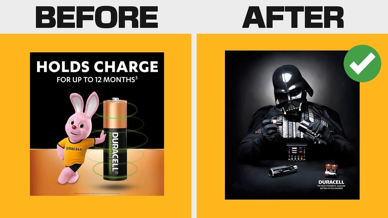
One of the first steps to standing out in the design world is to introduce unexpected elements into your work. For instance, while designing a skincare product’s packaging, combining abstract illustrations with realistic imagery can create a unique and eye-catching look. This blend of artistry not only makes the packaging stand out on the shelf but also conveys a message of innovation and quality, setting the brand apart from competitors.
Cognitive Dissonance in Design
Cognitive dissonance, a technique that introduces tension and conflict in design, can provoke thought and encourage viewers to reconsider their habits or beliefs. A striking example is juxtaposing a cigarette with an explosive element, which can make viewers confront the dangers of smoking. This method is effective in creating impactful messages that stick with the audience.
The Power of Humor
Incorporating humor into design, especially when combined with pop culture references, can create a positive connection with the audience. A humorous element not only engages viewers but also makes the message more memorable, benefiting the brand’s image in the long run.
Creating a Halo Effect
The halo effect is achieved by creating a positive impression through strategic design elements. For example, using high-quality images of exotic destinations on a travel agency’s website can create aspirational feelings, associating the visual appeal with high-quality service. Similarly, elegant typography and appealing images on a menu can enhance the perceived quality of a restaurant.
For designers looking to deepen their skills in these areas, platforms like Bring Your Own Laptop by Daniel Scott offer comprehensive tutorials on various design software and techniques. Daniel Scott’s courses cover Illustrator, Photoshop, Figma, Webflow, and more, helping students learn at their own pace and with practical tools at their disposal.
Serial Position Effect and Design
The serial position effect is about the tendency of people to remember the beginning and end of a list more vividly. In design, this can be utilized by placing crucial information at the top or bottom of a poster to ensure key details are remembered. This enhances the design’s effectiveness in conveying essential information.
Color Saturation and Brand Identity
Adjusting the color saturation can significantly impact a brand’s identity. Desaturating a brand’s primary color can convey sophistication and elegance, appealing to a more mature audience. Conversely, increasing saturation can create a vibrant, youthful appeal. This principle is crucial not just for branding but for any design work where color plays a pivotal role.
Using Analogous Colors
Analogous color schemes, such as combining soft greens and blues, can create a serene atmosphere, perfect for designs related to relaxation and tranquility, like a spa’s branding. This method ensures visual harmony and evokes specific emotions aligned with the brand’s identity.
Movement and Flow in Design
Effective use of movement and flow guides the viewer’s eye through the design, enhancing readability and engagement. This technique can be realized through directional lines or design elements, shaping the viewer’s journey across the canvas. Tools like Luminar Neo can aid in creating compelling visual narratives that guide the eye seamlessly.
Connecting with Natural Biorhythms
Designs that align with the audience’s natural rhythms of activity can enhance engagement. For instance, a fitness app might use dynamic imagery and colors that vary with the time of day, reflecting the user’s energy levels and supporting their fitness journey.
Evoking Emotions with Fear
Using fear judiciously in design, such as in safety signage, can create a sense of urgency and convey the importance of warnings. This technique taps into the audience’s survival instincts, compelling them to act or change behavior based on the design’s message.
Visual Metaphors: A Universal Language
Visual metaphors convey complex messages instantly, transcending language barriers and cultural differences. By representing ideas visually, designers can create universally understandable and memorable designs. Platforms like Placeit and Envato Elements provide resources that can help designers craft compelling metaphors.
Empathy Bias in Design
Understanding and tapping into the audience’s emotions through empathy bias can create more relatable and impactful designs. Whether it’s designing for a community event or a charitable cause, incorporating familiar visuals and narratives can foster a deeper connection and prompt action.
These design techniques, supported by resources from Dealjumbo, GraphicRiver, and others, offer a foundation for creating more engaging, memorable, and effective designs. By applying these principles, designers can craft works that not only catch the eye but also resonate deeply with viewers.
Timestamps
0:00 Why 12 Techniques WIll Help You
0:12 Technique 1
0:55 Technique 2
1:40 Technique 3
2:17 Technique 4
3:25 Bring Your Own Laptop
4:30 Technique 5
5:17 Technique 6
6:03 Technique 7
6:55 Technique 8
11:20 Technique 9
12:09 Technique 10
12:50 Technique 11
15:10 Technique 12
16:18 TEST
@GraphicIdea-GI
First comment❤
@dechofficial
❤
@dearruebenstudios
2nd comment
@MoreCreativeGFX
Amazing
@feleciaward1563
Insightful
@SatoriGraphics
How did you do in the test at the end?
learn more here: https://www.youtube.com/playlist?list=PL-c9Rq56P4KmK4sVH49C4rjYh5VH6uK4o
@GitaGyaninsite
Every time you teach me a new things..thank you sir
@samuelswanzy-baffoe8007
So insightful. There's always something new to learn. Thank you!
@Mylanyoutubechannel
Valuable! Thank you
@mannart3734
Thx for providing this info dude I like your video editing style
@Gamezo636
Insightful
@Gamezo636
Hi i am indian
@budhrajkumar2587
Sir how to maintain brand consistency in social media creatives
@Labina96
This video was a memory refresh. Thank You, your videos are delight and your explainations are pretty on point and examples used are really good as well.
@Sam45612
amazing video of refreshing our basics and taking it to an advanced level, need more videos like such, Thank you
@NANAROCK07
I really love the way you teach us every time, clean, relaxing, moderne vibe. It's enjoyable and makes me really focused
@mariomills
That icecream one was the best and most effective design ive ever seen..
@ryanasazaki1291
Another banger of a video, I can confirm that serial positioning does work, as I recently just stumbled across the phenomena when comparing different slides of design from different projects, both the first and last design share similar color schemes, and I instantly remembered, and reminded back on the first page, despite that there was six, seven of them. Yet the same thing did not occur when both similar design were sorted alongside each other at the end.
When you were shown a memorable thing first and foremost, you'll instantly reminded about it again whenever a similar instances of it is happening yet again.
@chrisjpndala7576
Great 👌 video..im going to try these styles 🎉🎉
@thewebstylist
Awesome video as always sir! I will say I didn’t think image on rt in thumbnail was a very good design, it should pop at any size but couldn’t tell what it was about. Amazing video edit as always
@vivekjagtap5327
What a knowledgeable start for the day, Can't wait to apply these tips. Thank you!
@JeiShian
I love your videos very much and I've learnt a lot. Thank you so much!❤
I have a comment about the the use of the jumping emojis: I think they are in conflict your elegant voice and elegant presentation. I felt distracted, in a bad way when I saw them, because these emojis are usually used by lower effort and less elegant people like me 😆
@daneilgraphics2337
this video is of 19 minutes and i watched complete without skipping any second because you can't get bored if you are in the world of satori. love you satori
@ScaryMannJK
Anyone else also notice this on the coffee/alarm clock ad: the way the light reflects from the coffee, there is a human-silhouette showing. Just enough to capture the shape, so it’s reflecting you looking at it. But not enough detail to look like anyone in particular.
@TrippiePineapplz
Your videos have been showing me so much thank u!
@zeronz87
1:32 Can someone explain how cognitive dissonance applies in this example, please? 🙏 1:32
@RafaelNoronhadeOliveiraSoveral
Satori my beloved
You should do content aimed to the more advanced designers!
@mariielee12
What a great video. I will be rewatching later and taking notes!
@suitabdou8
I love your content
@njengathegeek
This was so educative
@mtproduction726
Watching the smoking part while smoking a cigarette 😂
@bestbotreview
@2:37 text overlay makes it hard to read. You can hire me for graphic design layout tips 😂
@fuelformind
Great course
@BamTanYoutube
Thanks for sharing this! Just took down notes. I am a complete beginner in Graphic design and this video really does help me a lot.