Unlocking the Secret to Exceptional Graphic Designs: A Step-by-Step Guide
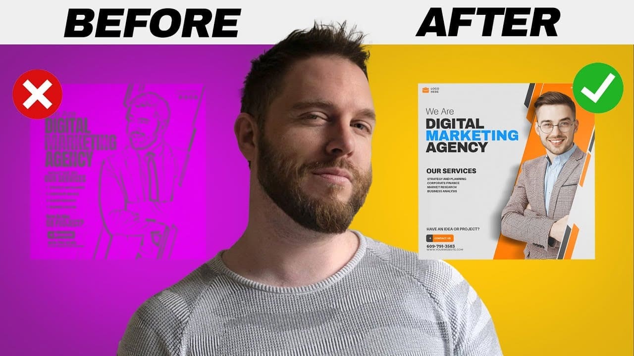
In the realm of graphic design, creating a piece that both you and your client love at first glance can sometimes feel like catching lightning in a bottle. But what happens when your design doesn’t immediately spark joy or meet expectations? Don’t fret! Transforming a less-than-stellar design into your best work might be easier than you think. Let’s dive into a process that can help you elevate your graphic designs from good to great.
Step Back and Reflect
The journey to improving your graphic design starts with a simple, yet crucial step: taking a break. Whether it’s an hour or a day, stepping away from your work can provide you with fresh eyes and a new perspective. This time away is your secret weapon in the design process, allowing you to return to your project with renewed energy and insight.
Evaluate Your Design with Technical Precision
Upon your return, it’s time to assess your design through a technical lens. Revisit the fundamental principles of graphic design and critically analyze where your project may have fallen short. Is your alignment off? Could the hierarchy use some tweaking? How balanced are the elements within your design? These are the questions that can lead you to identify the specific areas that need refinement.
Revamp with Principles in Mind
After pinpointing the weaknesses in your design, it’s time to put your findings into action. Adjusting your layout to incorporate more white space, reorganizing content for better readability, and introducing new colors for contrast are just a few strategies that can breathe new life into your design. Tools like Luminar Neo can be instrumental in adding those finishing touches that make your design pop.
Align Design with Purpose
Every design has a goal. Whether it’s to sell a product, inform an audience, or evoke a specific feeling, understanding the purpose behind your project is key. Ask yourself if your design effectively communicates its intended message and meets the client’s objectives. If the answer is no, it’s time to revisit your design strategy and make adjustments accordingly.
Consider the Emotional Impact
Design is not just about aesthetics; it’s about how it makes the audience feel. For instance, a design for an organic beauty product should evoke feelings of cleanliness and purity, possibly through the use of desaturated colors and minimal typography. Ensuring your design aligns with the desired emotional response is essential for its success.
Edit Ruthlessly
A common pitfall in design is overcomplication. Take a critical look at your design and ask yourself what can be removed without sacrificing the message. Simplifying your design by removing unnecessary elements can significantly enhance its effectiveness. Resources like Placeit and Envato Elements offer templates that can inspire you to achieve a balance between simplicity and creativity.
Utilize the Right Tools and Resources
In today’s fast-paced design world, having the right tools at your disposal can make all the difference. For high-quality design assets, platforms like Dealjumbo, Envato Elements, and GraphicRiver are invaluable resources. Whether you’re looking for unique fonts, eye-catching templates, or 3D objects, these platforms can provide you with the materials you need to elevate your design work.
Conclusion
Improving your graphic design skills is a journey of continuous learning and adaptation. By taking the time to reflect, critically evaluate, and refine your designs with purpose and simplicity in mind, you can transform any project into a masterpiece. Remember, the key to exceptional design lies in understanding the basics, aligning with the goal, evoking the right emotions, and editing with a discerning eye. With these steps and the right resources at your fingertips, you’re well on your way to creating better graphic designs that both you and your clients will love.
Timestamps
0:00 You & Your Client Are Not Happy
0:07 Step 1: Bad To Good Designs
0:24 Step 2: Bad To Good Designs
2:40 Step 3: Bad To Good Designs
3:38 Step 4: Bad To Good Designs
4:46 Step 5: Bad To Good Designs
6:23 Recap
@MR_Usama624
Very helpful video ..
thanks❤
@samuel-maps
Danko! for being a informative resource for us creatives
@raajabalaajeps
Hello Satori,I recently did my graphic design course I have a software knowledge on illustrator and photoshop and some adobe suite I have been following you to gain the design knowledge and your works really helps me a lot It will be so helpful if you provide designing courses for exact beginners like me to work faster as there are so many videos don't know what to watch for the first,Its a humble request from me to provide beginner playlist for guys like me to enter into this design field fearlessly REALLY THANKS FOR SHARING YOUR KNOWLEDGE
@Kronosbattlemaps
Such an improvement! Only thing I'd touch up is making the contact us box from orange into the the same blue to off balance that striking blue text 🙂
@tynzdigital
Another very informative video
@PRAKASH-xn8fy
1001th Video ❤ love you my teacher 🎉
@Haribollll
Client will still say. It looks boring and empty.
@riverabagalle7485
Never fails to teach something new. Keep up the amazing work satori!
@SB_2009
Nice Video, Very Helpful.
@SB_2009
I am working on email mobile signature and Digital Business Card. I am a student. My Target Audiences are Students and Teachers. How can I make it better?
@husacool
Is there something in that cup? Thanks for your answer 😉
@darndarn99
That cta is horrible!! “Contact Us” as a cta is just so off, mixes into the same as any other business
@dynamicentertainment951
this is helpful
@graphicallydeb9897
I have accidentally deleted designs I liked… the redo goes pretty fast, has smaller files, and almost always is better. I don't recommend this as a general workflow habit- but I will say, it has similar results as doing a careful review. lol.
@m.hassam9844
Honestly the before design is better then the after one in your thumbnail Master/ Sensei
@PrakDyna
Thank BOSS
@davidfitcher2953
I was hidden, now I'm getting out of this orange box
@bilal1628
I'm a beginner graphic designer, I can create simple things like social media posts, letterheads, business cards, brochures, etc.
, but these things are no longer profitable.
attention anymore so I don't know what to do and Should I also pick one thing and be good at it or try to learn many things at once and people are doing very progressive work in this field and I don't know after How do I improve my relationship with myself, because even though I haven't worked with a real client on the simplest things I can't directly proceed first?
@thatGreninjaGuy
Honestly, removing copy text is something i always want as a designer but none of the clients want it.. they want everything on the page.
Recently i had to make a cover for an FB page of a school and the content was overloaded with copy text.. it took me lot of iterations and some convincing to get it work but obviously with all the copy text.
@SqueakyWeasel247
Thanks for the great inspiration. Clients always seem take the introduction of white space and "air" as an invitation to decide that some frivolous unnecessary additional element has to fill the space I've just created.
My only gripe would be with the film example I'd bring some of the top line wording forward over the pic … otherwise that HL could be "We Make Film", "We Take Film", or even "We Fake Film".
@ellertrunarsson3055
I really like the font on the Rx website 5:08, does anyone have the name of it?
@QuanticDreamer
One more great video!
The camera one is big for me, because my inner artist always tempts me to decorate needlessly. I needed the reminder.
@iseemtobelost8265
Great video, something I’ve learned from music production is that there should only be one featured point of interest. Everything around that should only serve it, not compete for attention.
@samuelbatsanarh2341
I use to love your before and after videos but for some time now you have stopped making videos on that
@sunnytwinny
this video is superb! and right in time for me. I always beat myself up choosing the best design variations. More vids like this would be awesome! Anyway thank you so much for making this!
@fdboz
Wow, this was recommended to me through shorts and I'm in a place now which I can't be creative and do my assignments well. they are a mess and I am afraid i won't be a good designer in the future and questioning my decisions.. saturday I worked on a project's sketches for a whole day and couldn't do something slightly good and now i see this video. definitely will watch it now. maybe I will learn why I SUCK
@gsunny707
1:32 Just blew my mind how you fixed it in by just moving few of the things on same design… Thank you always for helping us out in the field of Graphic Design
@ethiotibebgraphicdesignaca4301
thankyou so much
@SzamBacsi
"SLEEP ON IT"
I agree you, Sir, can't agree you more